At first I thought it was a mistake, it was a great surprise when the team at the Southbank Centre invited me to the Press Viewing of David Shrigley’s Brain Activity exhibition at the Hayward Gallery. But it turns out they read my blog and enjoyed it. I was most flattered and grateful!
So, David Shrigley. Let me begin by sharing an anecdote with you, how I first got introduced to his work. Well, like many other people, it was through a greetings card. Here is the image.
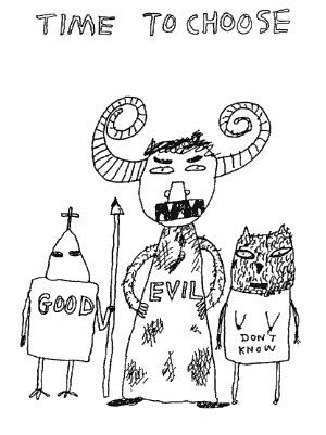
I bought it as a birthday card for a friend of mine a few years ago, she now has it pinned to her desk at work, she loves it. The birthday message squashed inside now meaningless compared to the fun moral conundrum of the drawing itself. It certainly talked to me.
Look at the decisive strength and self assurance of both the dignified Paladin and the monstrous attractive power of the horned Devil person. The “Good” figure is righteous, unflinching in his belief, honourable, the guy (or girl) you want on your team. I just imagine his (or her) face is equally expressionless as the helmet which covers it. He/She hands out loaves of bread to the poor and fights dragons. Perhaps a bit boring, but utterly reliable. The “Evil” figure is a tower of naughtiness, the guy you want to go drinking with, he just exudes self indulgence. A night out with him would be dangerous, but great fun, assuming you don’t lose a limb or your soul along the way. He’s thrusting his hips in your general direction, he’s saying “Raaaar! I’m full of sex!”
What does that leave? At the end of the line is the figure who represents those who aren’t sure, who are hedging their bets. The mournful sagging hairy tits of the undecided. Neither terrifying or worthy of respect.
My other blog has a Haiku about this very piece of work.
I accept that this might not be a proper arts critics interpretation. I quite liked this soundbite from Nicholas Lezard in the Guardian “Shrigley is having a go at the infantilising anthropomorphism currently sloshing around daily culture”. What?! I have to say that made me laugh almost as much as Shrigley’s brilliant, darkly fun, creative art. It’s something to do with chimps dressed as babies right?
I’ve said it before in other posts, but art (for me) should provoke a reaction. Should draw you in. Enjoying it is then a bonus. And Shrigley’s art is most definitely enjoyable, captivating, clever and silly. It made me smile and laugh aplenty too.
The idea of taxidermy is something that puts me off usually, but Shrigley pulls off a gentle take on it. Even when confronted with a squirrel holding its own severed head, a cute dog holding up a sign reminding people that he’s dead or a headless ostrich, you can’t help but go “awwwwwww”. The work, even if you miss any irony, is great fun. Do you need to intellectualise it? Of course not. You can just take it at face value and get that childlike rush of enjoyment when confronted with something cheeky or silly or most wonderfully… secret! Like the stuffed snake like fabric creatures wedged in the cavity between two walls and only visible through a tiny peephole in the plaster board. (Sorry I spoilt the fun of you discovering that for yourself).
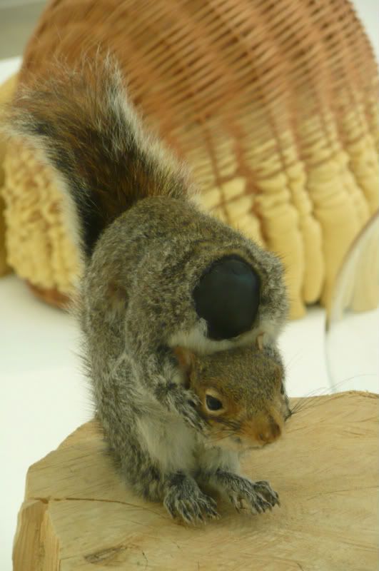
Nutless, 2002, Taxidermy Squirrel and Tree Stump.
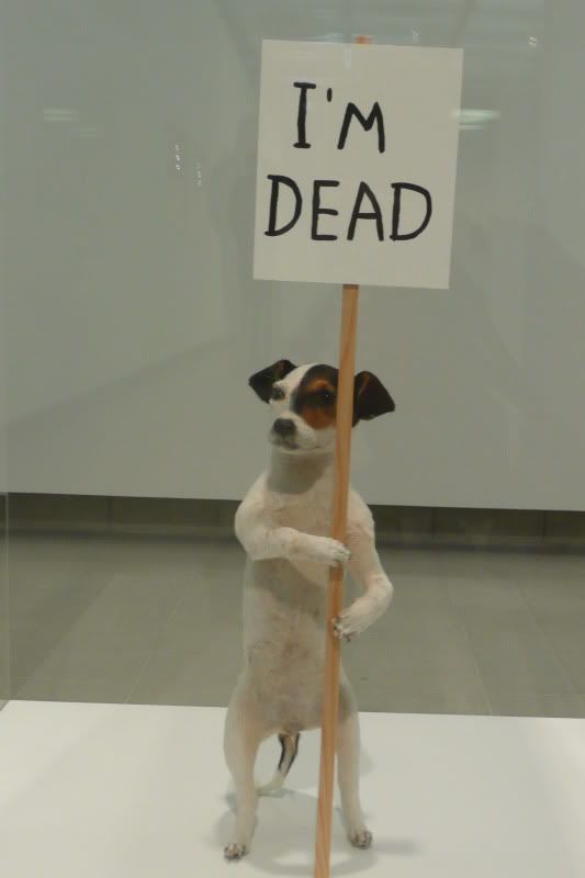
I’m Dead, 2010. Taxidermy Puppy, Wooden Sign and Acrylic Paint
The exhibition follows 4 themes. Death, Misery, Characters and Misshapen Things. Which is in itself and without any explanation needed, awesome.
The exhibition showcases Shrigley’s diversity of skills, whether it be sculpture, taxidermy, paintings, photography, animation or his ubiquitous drawings with their laconic funny narrative.
This one made me chuckle – lots. It’s taken from a funny angle as it was high up and I’m only little.
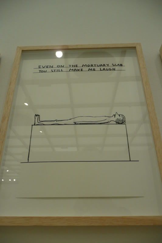
And it’s a treat to get a whole gallery room of them. Here is a small selection, I particularly liked “Too many humans, not enough robots” and “Shot for wearing shorts”
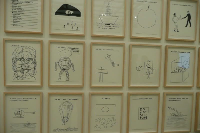
Oh, and this one, this one is fab! And ever so slightly unnerving.
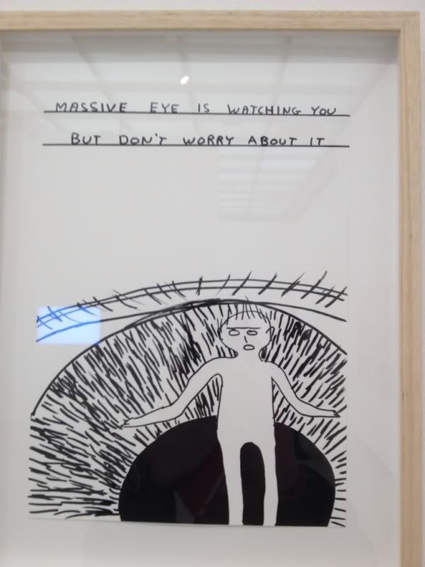
The exhibition meanders around the gallery and even outside it. I felt like my cat does when she explores a new space (usually a box, a superb box with turny bits and other rooms), that sense of big eyed, forward pointing eared wonder that only a cat can really do a good impression of. (human’s just shouldn’t).
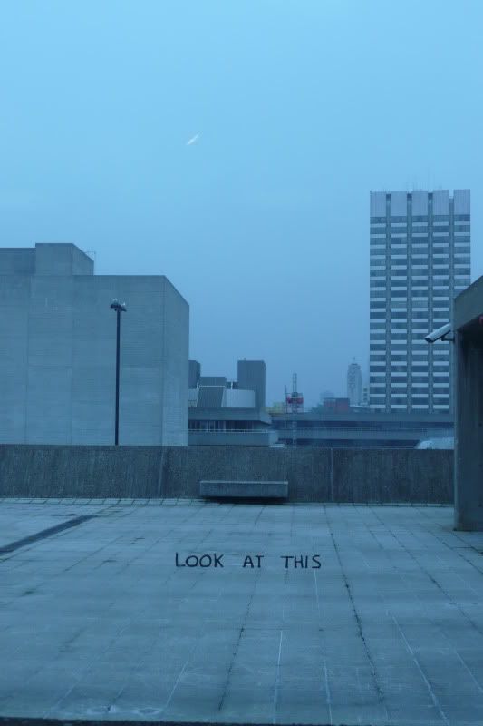
and
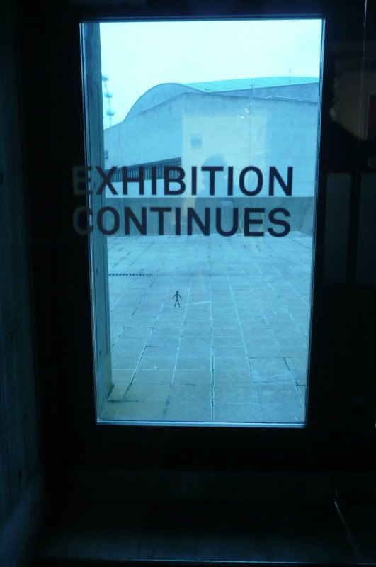
The exhibition is also a sensory treat, with aural stimulus, even in the lift; and from various animations. One, of a sleeping man twitching and breathing uncomfortably is projected over a stairwell in what looks like the fire exit. My favourite however is this one. Try not to smile at the marching squares!
Again, let’s not over analyse the message about belonging and fitting in here, or something. Just enjoy it!
The photography I also thoroughly enjoyed. “River for Sale”, a photo of a sign placed in a body of water was great as were others in the series.
And a set of black and white photographs, 20 of them, which when displayed together made a big impact. I haven’t shared images of these, you’ll just have to go to the exhibition and see how flippin’ brilliant it all is!
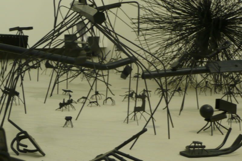
A big chunk of a gallery room is taken over by an insectoid alien landscape. It’s very compelling, looking at all the little embellishments and details, twisted and formed in metal.
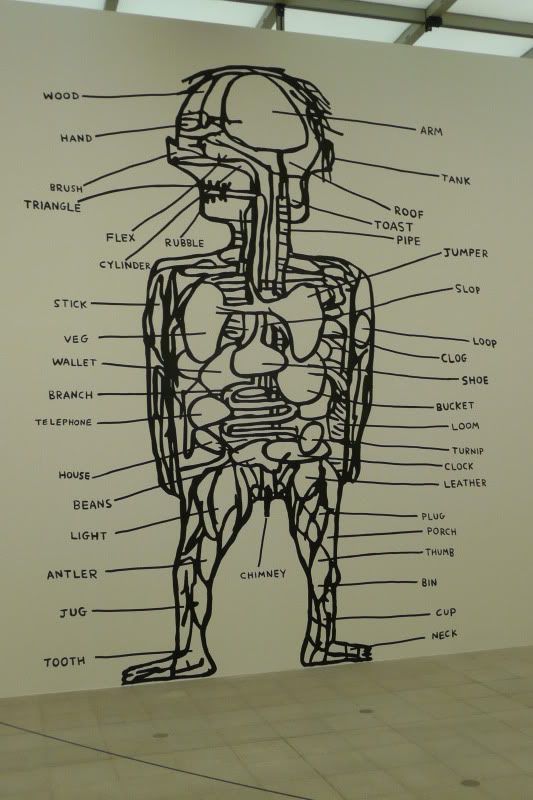
And this giant, specially created for the exhibition, he’s probably 12 – 15 feet tall. I love his labels! Anatomically accurate.
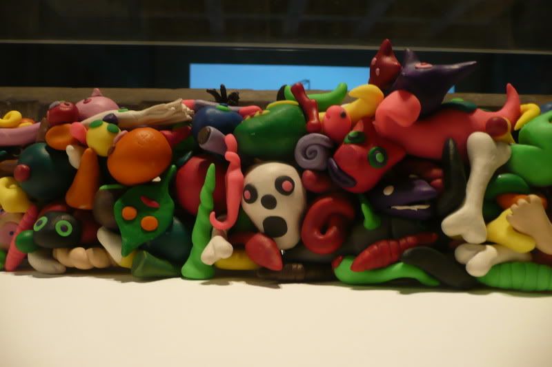
I found the detail in the next piece quite fascinating. The little Edward Munch scream face was a great touch too. The title made you think too, what’s in those spaces where we don’t often look? “The Contents of the Gap between the Refrigerator and the Cooker, 1995”
Shrigley himself was present, to do a little talk with the curator Cliff Lauson and pose for pics with his creations. I felt so sorry for him as the photographers made him stand next to his headless ostrich. He’s tall, so cruelly and not even subliminally they made him stand next to it. “That’s right, crane your neck, be more ostrich like, go on!… Lovely!” click click click. “Smile… bit more leg, that’s it” click click click “hands on hips, turn round” click click “coy look over the shoulder” click click, I could go on embellishing this scenario but I fear where my imagination will take me. But they did treat him like he was in a glamour shoot… a little tiny bit. It wasn’t something that came naturally to him. He was kind of awkward, like some of the elongated characters in his drawings, an eyebrow slightly raised in tolerant annoyance.
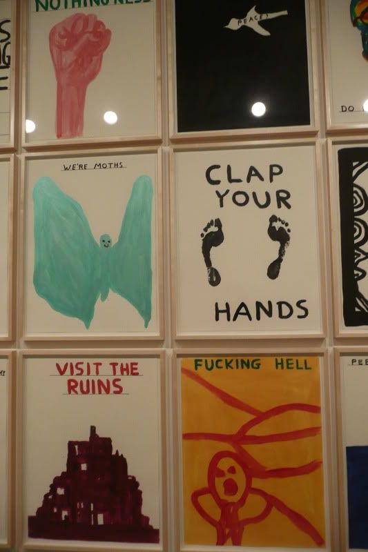
The talk itself was very interesting (the Q&A was sadly too short and he was mobbed by proper journalists afterwards so I couldn’t ask him any questions). What I found fascinating was his description of the creative process, how his paintings, specially made for the exhibition and occupying a whole wall, were many more in number, he disposed of three quarters of them before putting up the rest for selection. Which meant he made 150 paintings of which over 100 were disposed, ending up with only perhaps 30 on show. He was also (good naturedly) annoyed with the curator that his painting “shit” didn’t make the cut. I would have certainly like to have seen it. But what was interesting is he wouldn’t let anyone into his own criteria for selection, those that were disposed, would stay disposed. He couldn’t let anyone else into the editing process. “I don’t want to go there” he said decisively.
He described his artistic process as having something in common with Beckett (who he admires) “Tell people less than what they need to know”. The economy of narrative is important to him. He talked of his time at University (he got a 2:2, just like me) and how he was fortunate in that he is from a generation (in his early 40s) where he got a grant and had their fees paid without the huge debt students rack up now. And how, as a poor grad on the dole, he pushed forward his drawing as in the absence of a studio this was the easiest way he could work his art. I also liked his humility, he bears no grudges to anyone who judges the quality of his art, but he appreciates the great honour of showcasing his work at somewhere as prestigious as the Hayward. He’s a quiet likeable man, but you can see he’s got a mischief about him too (threatening to hack the hacks with his bronze swords on the wall in the adjoining gallery room if they were mean about him) and of course this humour pours out of him into his work.
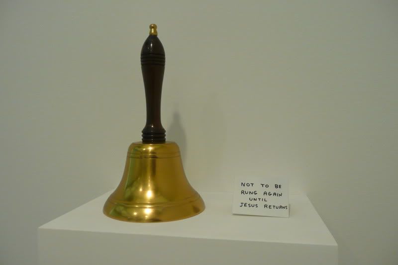
The Bell, 2007.
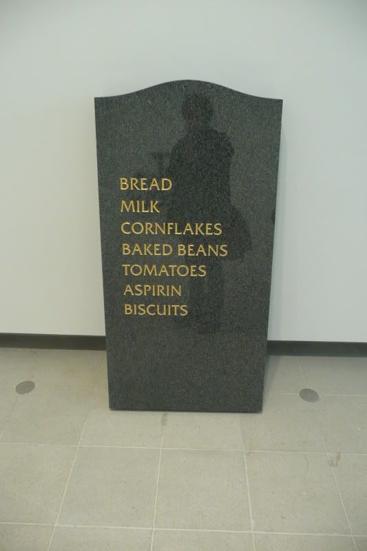
With regard to the humour, the piece of work I enjoyed most was the gravestone (2008). In itself it is funny, but I imagined the process of commissioning a gravestone carver to make this work for him (I assume he conceptualised it and asked someone to make it). Of course funerals and all the bureaucracy and business dealings around them is quite a sobering experience. Those who work in the trade could be blasé about it all, it’s their job after all, but I respect that they always appear to be “in the zone” to offer the utmost respect to the grieving relatives they deal with every day. I imagined the conversation.. “You want WHAT on the gravestone?” this made me feel happy, the absurdity in this symbol of death. I hope whoever carved it saw the funny side too. Life’s too short right?
David Shrigley, Brian Activity is on at the Hayward Gallery until 13th May 2012.

1 comment:
Great post Mel and fantastic pictures. Intersting to hear what kind of character Shrigley was in person and I absolutely love the quote you've put in there from one critic - ahahahaaa....hahahhaaa.ha. ahh, brilliant. Also enjoying watching the marching squares again
Post a Comment